Every Scottish Premiership club has now revealed its home kit for the 2026/27 season, and as you’d expect, every fan thinks their team’s kit is the nicest. To settle the debate, the team at BestBettingBonuses asked Glasgow-based fashion expert and personal stylist Elena Taggart from The Closet Stylist to review all 12 shirts and rank them from best to worst. Elena judged each kit on colour, cut, detailing and how well it would actually work on the pitch.
The Full SPFL 2026/27 Kit Ranking
Elena Taggart ranked all 12 Scottish Premiership home kits from 1st to 12th.
| Rank | Club | Verdict |
|---|---|---|
| 1 | Aberdeen | Effortless, deep red winner |
| 2 | Celtic | Luxury gold detailing, 10/10 layout |
| 3 | St Mirren | Timeless black and white |
| 4 | Hibernian | Crisp green with raglan sleeves |
| 5 | Dundee FC | Smart navy, slightly generic |
| 6 | Rangers | Well balanced but repetitive |
| 7 | St Johnstone | Warm colour, 80s carpeting print |
| 8 | Falkirk | Great steeple crest, dated overall |
| 9 | Hearts | Lovely burgundy, odd shoulder detail |
| 10 | Dundee United | High-vis vibes |
| 11 | Motherwell | Teletubby chaos |
| 12 | Kilmarnock | Two-year-old with a blue Sharpie |
1. Aberdeen
Looking the part 🫡
Secure your 2026-27 Home Kit ⤵️
— Aberdeen FC (@AberdeenFC) July 26, 2026
Aberdeen take the top spot, and it was not a close call. Elena rates the shirt as the most complete design in the league.
What Elena likes: The red is deep and rich, and it looks expensive. The detailing is subtle rather than shouty, and the whole thing will stand out on the pitch without trying too hard. “Absolutely everything,” she says. “Top points all round.”
What Elena doesn’t like: Nothing. The kit is effortless, and there is nothing she would change.
2. Celtic
🍀 The brand new Celtic FC x adidas 2026/27 Home Kit!
The shirt is a tribute to Celtic FC's most iconic 1966/67 season, and the local roots of the players who made the magic happen. 👇
— Celtic Football Club (@CelticFC) May 6, 2026
Celtic finish a close second thanks to one design choice that lifts the entire strip.
What Elena likes: The gold detailing. It elevates the shirt and adds a touch of luxury that most kits never reach for. Elena also points to the placement of the sponsor name and the club badge, which she scores 10/10 for attention to detail.
What Elena doesn’t like: Horizontal stripes are a risk. They can make even the fittest player look chunkier than they are. The gold makes up for it.
3. St Mirren
Introducing our 2026/27 home kit.
On-sale now in the St Mirren Club Shop and online.
Buy now at https://t.co/qRpLsFmZ09 pic.twitter.com/DRXhe9qSB8
— St Mirren FC (@saintmirrenfc) June 19, 2026
St Mirren land on the podium with a shirt that plays it straight and gets it right.
What Elena likes: The minimalist black and white styling. It is elegant, it is timeless, and it will look as good in five years as it does now.
What Elena doesn’t like: Look at it for too long and it starts to give slight striped-pyjama energy.
4. Hibernian
New beginnings, classic look 🥬 pic.twitter.com/b2Hr9AlsYy
— Hibernian Football Club (@HibernianFC) June 19, 2026
Hibs get the colour right, and the cut backs it up.
What Elena likes: The shade of green is crisp and clean. The balance between the green and the white is exactly right, and the raglan sleeve works with the shape of the shirt.
What Elena doesn’t like: The sponsor. It is a small point, but a footballer running around in a shirt that reads “Bevvy” does not do much for the healthy, aspirational sportsman image, app or no app.
5. Dundee FC
The wait is almost over!
Dundee Football Club 2026/2027 Home Kit ⭐️
Available in store and online from 10am tomorrow – Friday 29th Mayhttps://t.co/3RzKH55vtC pic.twitter.com/WgayTzi83z
— Dundee Football Club (@DundeeFC) May 28, 2026
Dundee sit mid-table with a shirt that is well made but short on personality.
What Elena likes: It reads black at first glance and is actually navy, which is a nice surprise. In the right light, the navy should come forward and lift the whole design.
What Elena doesn’t like: It gives generic sportswear vibes. It is a little nondescript and does not stand out.
6. Rangers
🔵 Bound By Blue
Introducing your season 2026/27 @umbro home kit, built on tradition and worn with pride.
Available in stores and online from Wednesday at 8am. pic.twitter.com/yJdyVhF9S1
— Rangers Football Club (@RangersFC) June 23, 2026
Rangers get the fundamentals right, but Elena has seen this shirt before.
What Elena likes: The balance of colour works, and the red detailing on the sleeve cuff pulls it together.
What Elena doesn’t like: It feels familiar. Whether it is an intentional retro nod or not, the concept has been done dozens of times, and the result is safe.
7. St Johnstone
Introducing our 2026/27 home kit! 🔥#SJFC | @pumafootball pic.twitter.com/532c4Ziyhj
— St. Johnstone FC (@StJohnstone) June 15, 2026
St Johnstone have two good ideas and one that Elena would send back.
What Elena likes: The colour is warm and bright. She is also a fan of the collar shape, which she rates as super elegant on a football shirt.
What Elena doesn’t like: The geometric “eye-test” print on the blue. It brings to mind very intense 1980s carpeting.
8. Falkirk
Better meddle wi' the de'il…
👕 Introducing our home strip for the 2026/27 season, by @ONeillsSportsUK, with @McEwanFraser.
On sale Friday 3rd July, 9:30am.
➡️ https://t.co/g90uvduX2o pic.twitter.com/lCLAaN9xtc
— Falkirk FC (@FalkirkFC) July 2, 2026
Falkirk scores on sentiment and loses ground on design.
What Elena likes: The steeple on the chest. As a closet Bairn who has spent more than one Hogmanay at the steeple parties, Elena rates it as a proper local touch.
What Elena doesn’t like: It is boring, and arguably old-fashioned. Not in a cool retro way.
9. Hearts
Introducing your 26.27 hummel home kit ♥️
On sale now in-store and online
🤝 @hummel1923 | @StellarOmada pic.twitter.com/5vSF9iqaAB
— Heart of Midlothian FC (@JamTarts) May 29, 2026
Hearts have the best colour in the bottom half and one detail Elena cannot unsee.
What Elena likes: The burgundy is a lovely warm shade.
What Elena doesn’t like: The arrow detail on the shoulder. It looks like a tyre print, as if the player has been run over by the road crew from the Dundee United kit.
10. Dundee United
🪡 Woven Into Our 𝑰𝒅𝒆𝒏𝒕𝒊𝒕𝒚.
Introducing the 2026/27 #DUFC Home Kit by @ErreaOfficial 🤝
Available in-store and online from 9am on Tuesday 7 July. pic.twitter.com/Xdz2K7O3ij
— Dundee United FC (@dundeeunitedfc) June 27, 2026
Visibility is not a problem for Dundee United. Subtlety is.
What Elena likes: You will never lose a United player on the pitch. Sunglasses optional.
What Elena doesn’t like: It is giving serious high-vis. Spot someone wearing it in the street, and you would assume they had come to fix your tyre or were on shift at the never-ending M8 roadworks.
11. Motherwell
Our colours, our identity, our journey 🧡
Say hello to our 2026/27 home kit. https://t.co/mtrPgSI1lf pic.twitter.com/0GHHTdSvPB
— Motherwell FC (@MotherwellFC) July 1, 2026
Motherwell finish second bottom, and Elena struggled to find a positive.
What Elena likes: The sponsor’s name is spelt correctly.
What Elena doesn’t like: Everything else. If Dundee United went for road-worker styling, this one is Teletubby chaos, and it is actively making her eyes bleed.
12. Kilmarnock
A return to simplicity 👕
Inspired by some of Killie’s most iconic shirts, the 2026/27 home kit combines timeless blue and white stripes with a modern, confident look.
Rooted in tradition, shaped by history and proudly Killie.
Learn more about the inspiration behind the new… pic.twitter.com/vxiKuQoGNd
— Kilmarnock FC (@KilmarnockFC) June 7, 2026
Kilmarnock prop up the table.
What Elena likes: “Oh dear, next question.”
What Elena doesn’t like: It looks like it was designed by a two-year-old with a blue Sharpie. It does not look like the strip of a top-flight club.
About the Expert: Elena Taggart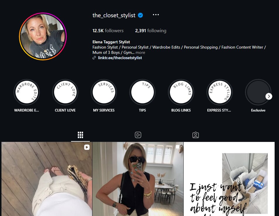
Elena Taggart from The Closet Stylist is a Glasgow-based fashion expert and personal stylist with more than 12,000 followers across social media. She works with clients on colour, fit and personal style, and she brought the same eye to this year’s SPFL kits, assessing each shirt on colour, cut, detailing and overall wearability rather than on club loyalty.
If you’re interested in working with her, you can reach her via her website or on social media.